2024 Apps and Homescreen
It’s the end of September which means it’s time for a new iOS version, and a new phone. This year I’ve moved down from a Pro to the plain iPhone 16 for a colorful change I hope I don’t regret. iOS 18 is out too, and you know as a nerd already on the iOS 18.1 beta. This year there were significant changes to the iOS homescreen for the first time in years; allowing for fresh organization and even terrible colors.
The homescreen
This is 2024 for my phone:
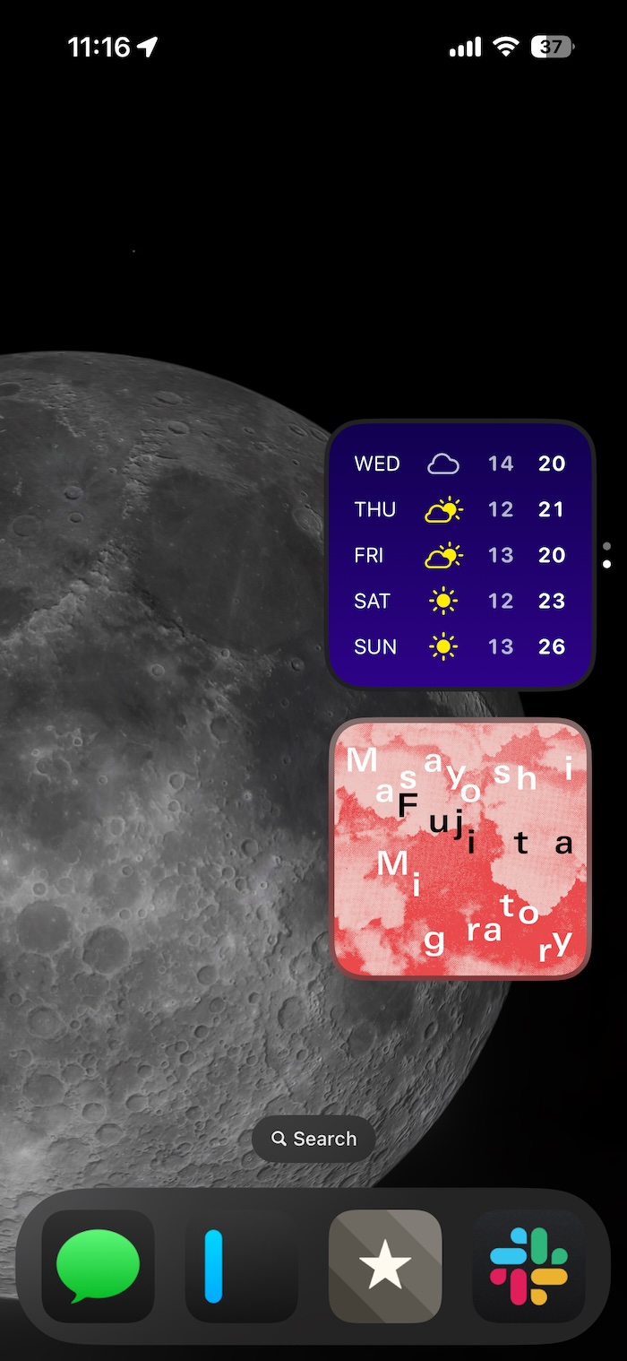
I have two stacks within easy thumb reach with the iOS calendar app and Carrot Weather on top, and Things and Albums below. I chose to use the large icon display in dark mode after some disastrous results with color theming during my beta testing. I like how the larger icons look, but especially how they hide the names of the apps. Maybe someone needs to be reminded which app is which, but I would suggest that person has entirely too many things on their phone.
The apps
iOS Calendar is basic, but now that my work phone has all my work appointments and my personal only has my personal ones I don’t need anything fancier. Siri finds appointments in Mail, and adding things manually is easy enough.
Carrot Weather is still too cutesy for me, but it’s a good weather app with everything goofy turned off. I never want my apps to talk to me in a snarky way (or at all really).
Things is the best todo app out there. The keyboard shortcuts, easy search, and simple gestures are how I get everything done. I’m even tempted lately to write more into the app, as the notes sections support markdown. If you need a simple, fast, and very well-designed app, look no further.
Finally, Albums is the best way to access Apple Music on an iPhone, particularly if you listen to entire albums.
The home row has Messages (soon with RCS—GoogleFi is the last to add this somehow), iAWriter (where I’m writing this), Reeder (classic, I guess), and Slack. These are the apps I use the most to talk to friends (Slack and Messages), read RSS feeds (Reeder), and write or take notes. Reeder and iA Writer are as fast and simple as Things, with great shortcut support and clean design. Slack is where I work, and despite being an app aimed squarely at the enterprise user, I talk to friends on it more than anywhere else.
Widgets
This year I’ve tried a few widgets, and settled on these:
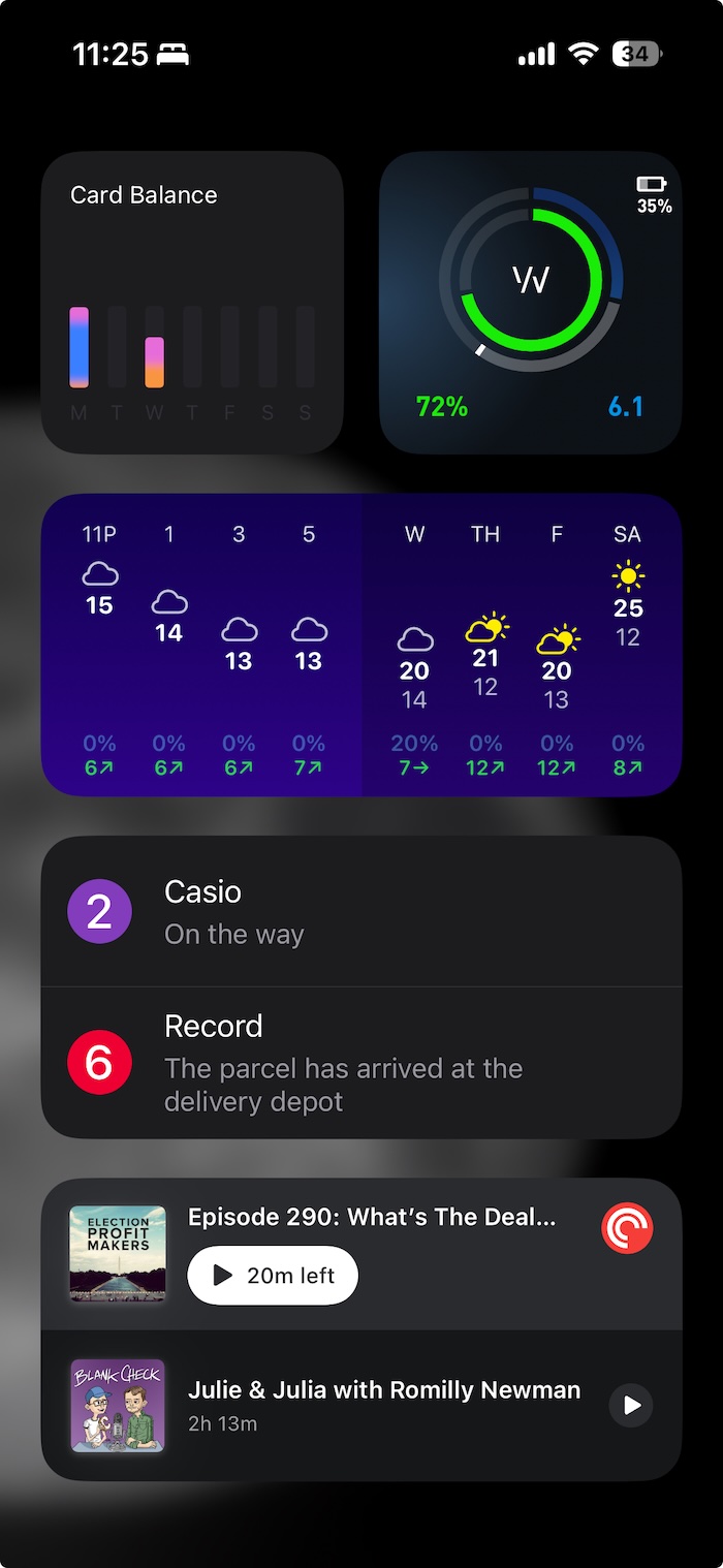
From the top, left-to-right is Wallet, Whoop, Carrot hourly, Parcel, and PocketCast. I use this screen to keep track of my spending, health, and the hourly weather for cycling. The Parcel app is how I know what is shipping to my house, and when to expect it, but I wish it had smart detection from my mail. PocketCast is the best app I’ve found for podcasts as a former Overcast user. It has smart speed, good organization, and isn’t obsessed with the color orange.
As a bonus to widgets, the lock screen can now be customized with new apps on the bottom right and left—I’m using Flashlight and Halide.
New phone
Every year since the iPhone X I’ve used the “pro” phone but beyond a nicer camera, I never had much reason to do so. This time around there’s only one difference between the two that might bother me: 120hz refresh vs 60hz.
The camera control button and a flagging battery are the reason I’m upgrading at all, though it would be a more ecological decision to just replace the battery. On the upside, the batteries in the 16 can be removed with low-voltage charge which means these phones will be easier to service.
I don’t have much else to say about the new phone yet, but hopefully the differences are few and the new button makes using my phone as my camera better.
Friday update: The camera control button is nice and the phone is great so far. I love the color (blue), and haven’t noticed much difference from the Pro beyond the lack of an always-on-display.
Until next time
If you have any cool app suggestions, or a neat homescreen to share, hit me up on Bluesky or Mastodon (@brook@xoxo.zone).