iOS 16 & a purple phone!
The new iPhone and iOS launched this month and I’ve used both for a little bit—iOS since the first beta. There are some fairly major changes to how Focus mode works, as well as yet-to-be-launched features that use the Dynamic Island to give live updates. I’ll run through my thoughts on the new phone and OS, and go over how I’m organizing and using Focus to help me through the day.
iPhone 14 Pro
Despite the color purple on my phone looking a lot more muted and business-y than my preferred tone, this year marks the first that I have a phone that isn’t kinda grey. Beyond the color and the bigger camera lenses, what really stands out is the new always-on display and Dynamic Island. The display is surprising in a way, as a long-time iPhone user, since it feels a little like I forgot to lock my phone when I see the screen still on. Because of how fast face-unlock is in its nth iteration the transition from dark, 1hz refresh always-on to full screen with tappable icons is very convenient, and I think makes the Lock Screen widgets very useful. At a glance I can see the weather, and a few other bits depending on layout (which I’ll cover in a bit), and jump right into a podcast.
The Dynamic Island, which I’m a little obsessed with saying this name out loud, is a solid change from the long-standing notch that I hope comes to the Mac too later. The transitions into and out of active state are solid, and since I use Dark Mode all the time, is eve less noticeable and distracting than the almost never in the way notch. Hopefully when 3rd-party software is updated to take advantage of the island it’ll be even more useful and fun.
Other than this two features, the camera is nice (but not wildly nicer), and it’s an eSim-only device—I’ve used eSim on Google Fi for a few years now and it’s chill.
iOS 16
I’ll be honest, I had to look up everything that changed in this new release while writing because after a few months of beta-testing it just felt normal.
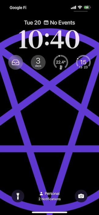
The most noticeable feature is addition of Lock Screen widgets and a customizable font for the time. Sure, Apple will never give users the freedom to make horrendous mistakes like Symbian did, but at the little bits of customization are a nice addition and can help ID what mode you’re in at a glance. My current personal focus mode is relatively simple:

The top section is Things, which includes a date, helpfully, followed by the current weather and highs and lows from Carrot Weather, a next delivery timer from Parcel, my Overcast queue, and a Home widget for my apartment’s climate. Weather at a glance is a very nice thing to have, especially if I’m charging my watch, but the unsung hero so far is the widget that immediately launches and plays from my queue. I think a nice mix of information display and quick launch (ideally with information) is delightful.
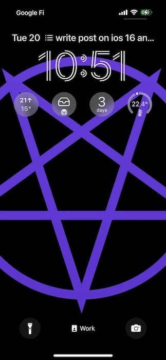
Using the new Focus modes, available in iOS 16, I’ve also created two other home screens that automatically trigger for my workday and when I’m winding-down for sleep. For a while this summer I customized my Home Screen for work to only show my work Slack app and a few other work bits, but our IT lockdown meant the only real difference is what widgets I use—I don’t need the quick access to the weather or my music since I work from home and play music through Sonos, so I show Things and my podcast queue in Overcast.
Every morning at 830 and night at 5 or for the weekend my phone moves back to personal mode, just in time for a bike ride. Focus can show or hide specific apps and Mail or Calendar accounts based on the Focus mode, but my company doesn’t use email, and I can’t load my work calendar on my device, so if you’re curious about those bits, I recommend other posts.

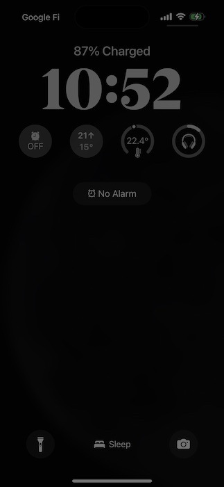
At night my screen flips over to a sleep view with a cool new rotating moon photo and quick access to my alarms and the battery life of my night headphones. Exciting? Not really. Useful? You bet!

Finally, I love the new notifications grouping and easier triage. Messages and updates are grouped by app and even hidden through a setting unless you like being overwhelmed. I vastly prefer choosing if and when I am distracted by incoming pings and messages, so this option is awesome. Using Focus, it’s now possible to mark certain contacts as notifying differently in different modes. I bet it’ll be useful for folks who have a nanny sometimes or limit their planning or friend texts to certain times. If you’re the type of person who enjoys boundaries and defining and demarcating your day, you’ll have a blast with iOS 16.
Change
So much of the new iOS and Phone feel like iterative improvements instead of the sort of massive upheaval that would bring out the grumblers and change-haters. While small changes and a few assorted features may not lead to hyperbolic blog posts, they are the sort of fit and polish I’m happy to see on my device. Once developers get to build more with widgets and the Dynamic Island, I’ll follow-up and see if it paid off.
For me at least, this year meant my iPhone is a little more useful without unlocking it and potentially getting sucked-in by the vortex of endless scrolling.