2020 Homescreen
This year was mostly a nightmare for all the gestures around reasons.
However, for my 2020 homescreen on my iPad and iPhone, it was pretty wild. iOS 14 brought the concept of homescreen widgets to iOS after years of waiting, and they’re pretty damn good.

Another year
Every year for the past few years I’ve written about the apps I’m using and what appears on my iPhone Home Screen. It’s become a fun annual post to think through how the app ecosystem and iOS in general changed over the year. I still use my iPhone quite a bit in quarantine, as it remains the easiest thing to haul around my house for podcast control and random tasks.
More change
3 app dock
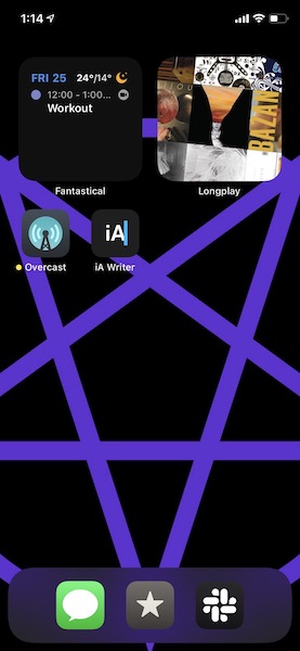
I kept my 3 app dock from last year, but replaced Music with Slack. I use Slack pretty constantly for keeping in touch with my friends, and also I work there. Lately, in order to encourage myself to log off from work on my off-hours, I removed my work workspaces from my phone. It’s delightful.
The other two apps are the same—Messages and Reeder. Both of these apps are a lifeline to loved-ones and reading respectively. I subscribed to a few friends’ Twitter feeds and a few newsletters in Reeder using Feedbin, and it’s quieter and slower over there.
No new app icons
An astute reader will see the five app icons on my homescreen and think: “wow, you’ve gotten rid of everything!” And indeed I have! iOS 14 brought the delightful App Library which enabled hiding most apps from the homescreen, relegating them to search and odd Apple-generated categories. I likely have a few more apps on my phone than before, but I never see them unless I need them. I love it.
Overcast keeps getting better, especially with Marco focusing on stability and usability over rushing to get iOS 14 widgets or other whiz bang new things into the app. I like that Marco seems to get that so many of us depend on this app daily, and takes major changes seriously.
iAWriter is where I write. Full stop. I wrote this post in iAWriter, and even wrote about how I write in it. It’s outstanding. I would happily pay much more money just to keep this app going. A+.
Widgets!
The elephant on my homescreen is the two prominent widgets at the top of the device. With the addition of regularly updating, informative blocks of app, I move my calendar and my music player into this format.
Fantastical is back! The widgets are great, and even though I can’t make it the default app in iOS this year—maybe next year? I think Fantastical still looks kinda weird on the iPad, but since I can view a smaller bit of it actively in a widget, I don’t need to open the full app nearly as often. The customization of the Fantastical widget is delightful, as others have written.
Longplay is a new app this year that focuses on reminding the listener about older, neglected albums in our collection. I think the way it changes around album art is cool looking, and I especially love that it focuses on the album as a coherent whole, unlike many modern music apps that are more geared towards singles and bangers.
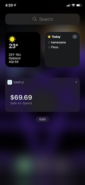
On my left screen… formerly the widget area (is this the name?) lives one app that was previously on my homescreen and another I went back to after an update.
 Things remains the way I get anything done in my life. I love it so much on iPhone, iPad, and Mac. The sync is fantastic, the organization is just-enough, and the keyboard shortcuts are a master class in how to do them right.
Carrot Weather temporarily dethroned Hello Weather due to the addition of widgets. I still don’t love this app or how it displays data, but the widgets are delightfully minimal so I don’t need to look at the whole app often.
Simple is my banking app. It’s important to always have “funny numbers” in your account as a key to appeasing the money demons that ensure a positive ROI. Top tip.
Other notable apps
Working Copy and Secure Shellfish aren’t on my homescreen, but they’re both pretty crucial to a few kinds of server and front-end work that I do for fun on the iPad and iPhone.
Darkroom is the photo editor I moved to after some recent updates made it even better. I still wish it could resize photos on export, instead of just changing the quality of the photo or video, but hopefully later they’ll be able to. In the meantime, I made an iOS shortcut that does the resizing for me, and commits the photo to my blog’s repo.
Missing widgets
One day soon, I hope my bank adds a widget, as well as Wealthfront, and perhaps Overcast and Sonos. Tot would also be an excellent widget for quick text entry. I don’t know if I’d keep it up all the time, but my Deliveries app also primarily functions as a read-only list, so it would be ideal for a side-screen widget.
Future hopes
I’m curious as more developers add widgets if their interest in adding more options for sizing and location. I think it’d be neat to have a single app icon widget, as well as write-capable widgets. Perhaps we’ll see this customization in iOS 15. I think now that the floodgates are open for what TikTok youth are seeing as custom themes, it’ll be hard to stem the tide of interest in actual shareable themes a-la Apple Watch. Further, I think it’d be pretty silly if iOS widgets and Apple Watch widgets didn’t end-up unifying in the future.
Ultimately, I’m super glad I don’t need to keep a ton of apps on my homescreen, and instead can show the apps I use most.